
Geography & maps
Geography is the home surface of Voterra. Everyone — every role — lands on a map and drills down from the whole county to a single street. The geographic views all share the same scoring colors, so a “hot” precinct looks the same whether you’re zoomed to the county or to one block.
The county map
Section titled “The county map”The county map is the default landing screen. It plots your organization’s voters as colored points or density, shaded by engagement tier: Super Voter → Hot → Warm → Cool.
What you can do here:
- Filter with the filter bar — by tier, party, precinct, or legislative district. The map and every downstream count respect the active filter.
- Drill down by clicking a region to descend one geographic level.
The county map shows aggregates, not individual voters. To select specific doors, go to Voters → Map and use the lasso — the selected count appears above the map, and Create Routes hands the selection to the route builder.
The Voters map plots every geocoded voter matching your current filter, not
a sample of them, so a lasso catches every friendly door inside the shape you
draw. The footer states this plainly — Showing N plotted of M total match —
alongside a count of voters the filter matched but that have no coordinates to
plot. On a very large selection the map will say it is showing the first batch
of dots only; the counts above it stay complete, and narrowing the filter brings
the rest into view.
Drill-down levels
Section titled “Drill-down levels”The same data rolls up at four nested levels. Each level is its own view with its own summary stats:
| Level | What it shows |
|---|---|
| County | The whole county — tier mix, total registered, turnout estimate. |
| Legislative district | One LD (e.g. LD 12, 13, 14) — tier breakdown and precinct list. |
| Subregion | A mid-level grouping of precincts inside an LD. |
| Precinct | A single precinct — its voters, scores, and recent canvass activity. |
Drill down by clicking into a region; use the breadcrumb (and the quick-jump pills beneath it) to pop back up or jump sideways to a sibling region.
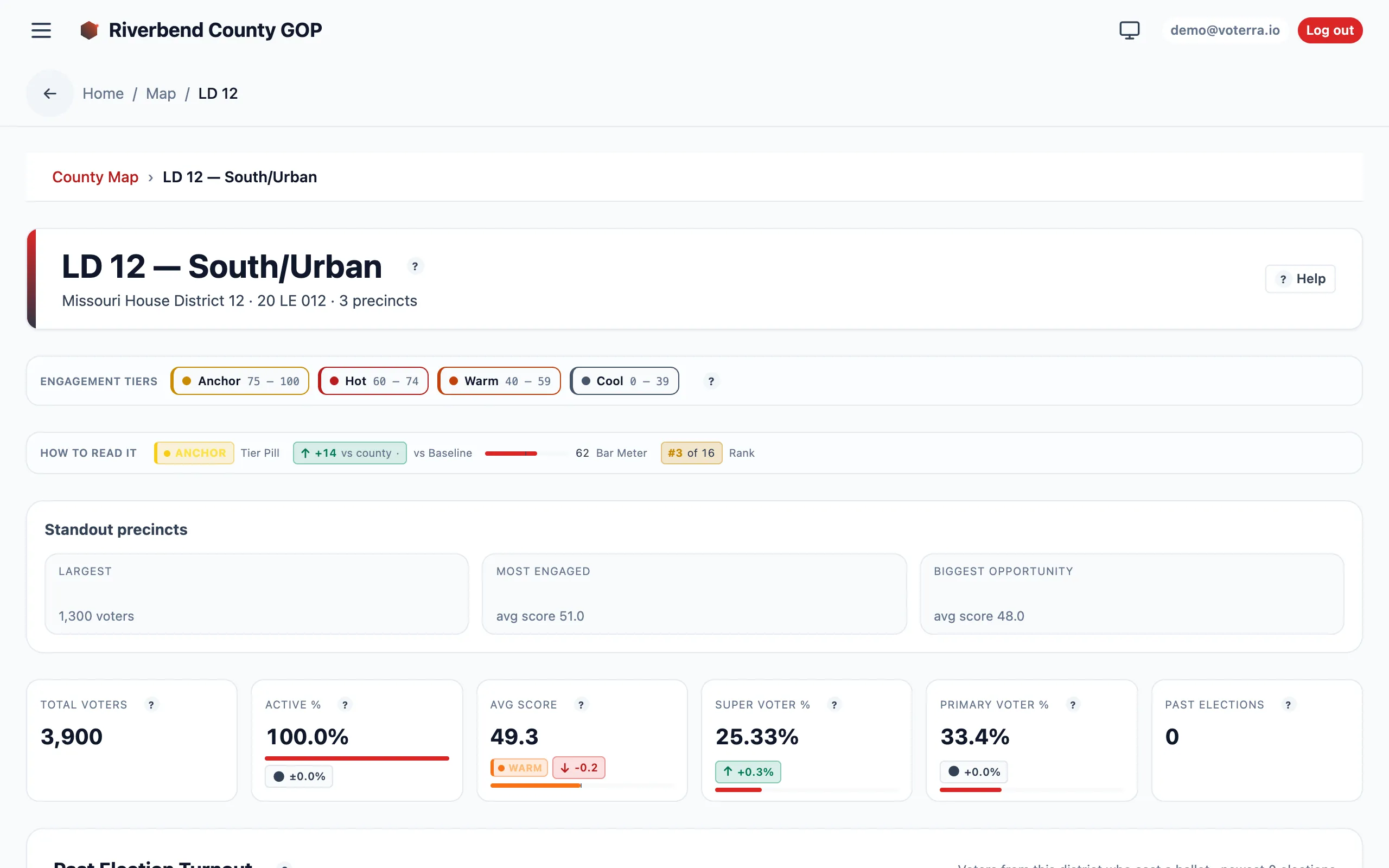
A legislative-district drill-down: standout precincts, KPI cards, and the turnout chart.
Power Map (street-level rollup)
Section titled “Power Map (street-level rollup)”The Power Map rolls voter scores up to the street segment. Instead of one point per voter, you see which streets are dense with friendly doors — the unit a canvasser actually walks. It’s the bridge between analysis and a walking list: spot a high-value street, then cut a route straight from it.
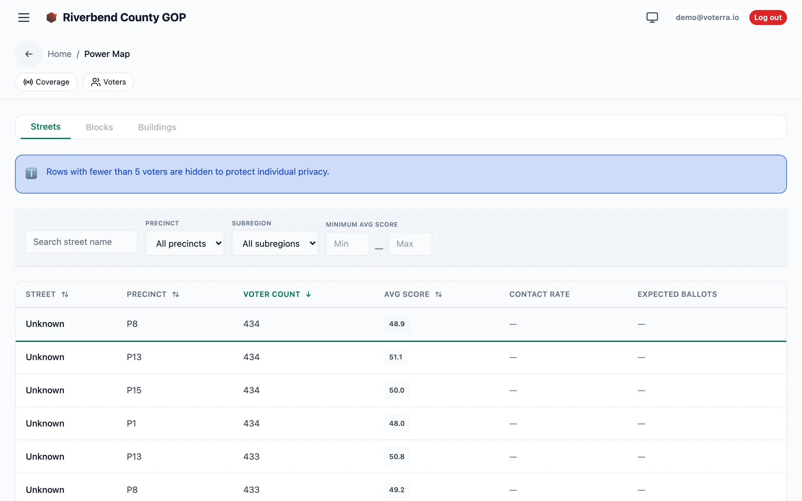
Streets ranked by voter count and average score — the unit a canvasser actually walks.
Knock-status map overlay
Section titled “Knock-status map overlay”The Voters map has a Color by selector at the top of the map. Switch it from “Tier” to “Knock status” and every pin (and every cluster halo) recolors by the voter’s most recent canvass outcome — Contacted, Refused, Come-back, Do-not-contact, Not-home, Never-knocked. The legend updates to match, and the cluster colors aggregate the outcomes of their members instead of the tier mix.
The overlay reads the same live canvass results your AAR review works from, recomputed for whatever filter is active — so it never goes stale.
Who sees this
Section titled “Who sees this”All roles can open the map and drill down. What differs is the data underneath: analysts and viewers see aggregate density and counts but not exportable individual voter PII, while field and management roles see individual pins. See Roles & access.